
Role
UX/UI designer
Duration
Jan - Feb, 2025
Team


Context
Genius is a platform for discovering, annotating, and discussing song lyrics and insights about music. This is a conceptual project for a real-world client.
Problem
Genius app presents usability issues related to presentation, interaction, navigation and discovery, making it difficulty for users to view and interact with song lyrics and annotations. This caused user frustration and reduced engagement with app features. This project aims to address the above usability issues by redesigning the app interface.
Read ahead for my design process.
User Research
I conducted desk research to understand the target user groups of the Genius app. In the Genius community, users are given "titles" based on their contributions. For example, a "contributor" is any Genius user with more than 300 IQ, which are points earned by contributing knowledge to the platform. Therefore, I categorised different users based their usage of the platform as they likely have different behavioural patterns and needs.
Music enthusiast
They use the platform regularly to read & contribute knowledge. They are the lifeblood of the Genius Community and account for the majority of Genius contributions.

@MetalSonic420
BIO
“I’m just an addict, addicted to music.”
STATS

Causal listeners
They use the platform only occasionally and tend to read only and not contribute much. They likely make up a significant portion of the users on the platform.

@mnb_00
BIO
mnb_00 is keeping quiet for now.
STATS

-> Music enthusiasts likely value effective interactions for contributing knowledge and engaging with the community, while the casual listeners may prefer less in-depth knowledge and prioritise the browsing experience.
Competitive analysis
To understand how Genius is different from the competition, I conducted a competitive analysis.

Musixmatch is one of the most popular competitors of Genius, offering a large database of song lyrics and translations.
Musixmatch focuses on the lyrics and the synchronisation with music, provides a karaoke-style experience. Genius is centred on user-generated annotation.

Shazam is a popular app for identifying songs by listening to snippets of audio
Shazam is more focused on song discovery and identification, while Genius is built around discussions and annotations.

Apple Music and Spotify are music streaming platforms. They provide lyrics for songs directly in their music players.
Apple Music and Spotify do not offer in-depth insights into the longs beyond the lyrics.
Crowdsourced annotations
Verified artist contributions
In-dept lyrics analysis and contextual information about songs
Varying quality of user generated annotation that cannot be trusted completely
-> Genius differentiates itself from competitors by leveraging crowd-sourced contributions, fostering an active and loyal user base, and building a rich database of insights valued by the music community. This project aims to maintain Genius's competitive edge by enhancing its community and social features.
Design audit
I conducted a design audit to compare the user experience and functionality of the web and the mobile version of the app.
Functionality

-> The web version is ideal for in-depth analysis of song lyrics and contribution of knowledge while the mobile version is ideal for quick access of content on the go. This project decides to focus on optimising the mobile experience as it presents more user experience challenges.
Usability testing
To further understand users' pain points with the the mobile app, I conducted a small-scale usability testing with friends who were Genius app users.
Participants: 2 identified as “casual listener” and 1 as “music enthusiasts”
Procedure: Participants interact with the app while being observed. They engage in Think-out-loud when completing following tasks:
Find the lyrics of a given song
View 2-3 annotations in the lyrics
Interact with the annotation by voting and commenting
Contribute an annotation to the lyrics
Freely explore the app for interesting content

Navigation clutter
When users explored the app, the navigation was described as cluttered and content was “all over the place”.
—> Simplify the app's navigation by prioritising the most important features and grouping related content more effectively.

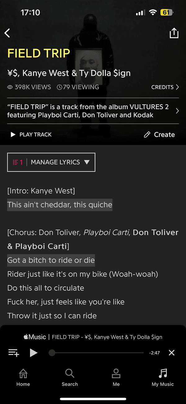
Lyrics vs annotation clarity
Users had difficulty distinguishing between the song’s lyrics and the annotations.
—> Introduce a more distinct visual hierarchy for annotation and lyrics.
Annotation interaction difficulty
Users struggle to find the option to contribute an annotation, and some were unclear what made a “good” annotation.
—> Improve the visibility of the annotation button and provide clearer guidance to help users understand the process for contributing quality annotations.

Content discovery challenges
When exploring the app, users expressed difficulty in finding interesting content.
—> Introduce a more personalised content discovery feature, such as song recommendations based on user preferences or trending annotations.

Ideate
I sketched out different layouts to improve lyrics vs annotation clarity, bearing in mind while music enthusiasts may peruse in-depth annotations, casual listeners may only want to read the lyrics.
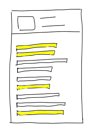

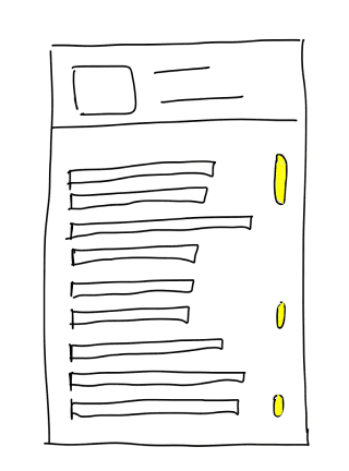
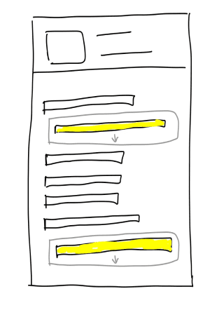

-> In-text highlight with a toggle was selected to prototype as it balances between clear visual separation of lyrics and annotation while keeping annotations engaging.
I redesigned the information architecture by grouping similar content under one tab and introducing a new tab for content exploration.

Prototype
I brought the sketches to life in high-fidelity prototype while aligning to Genius brand identity and design system.
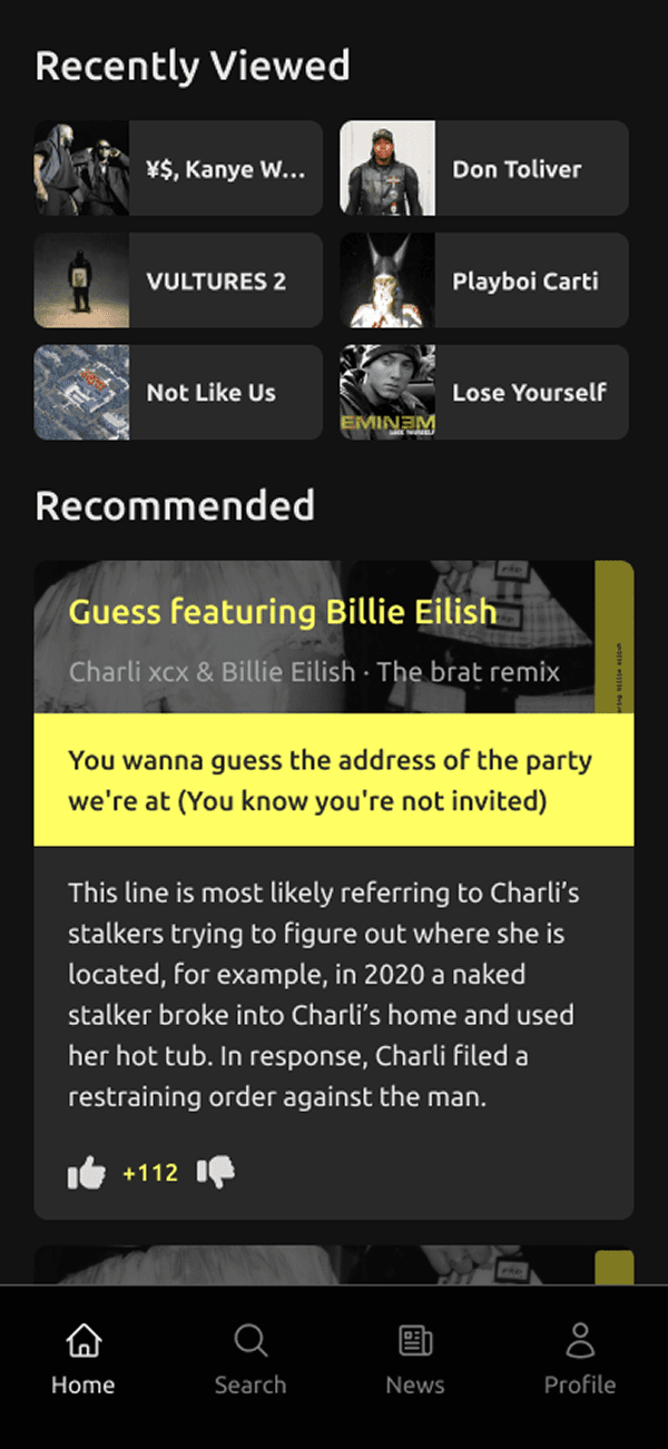
Focused Home
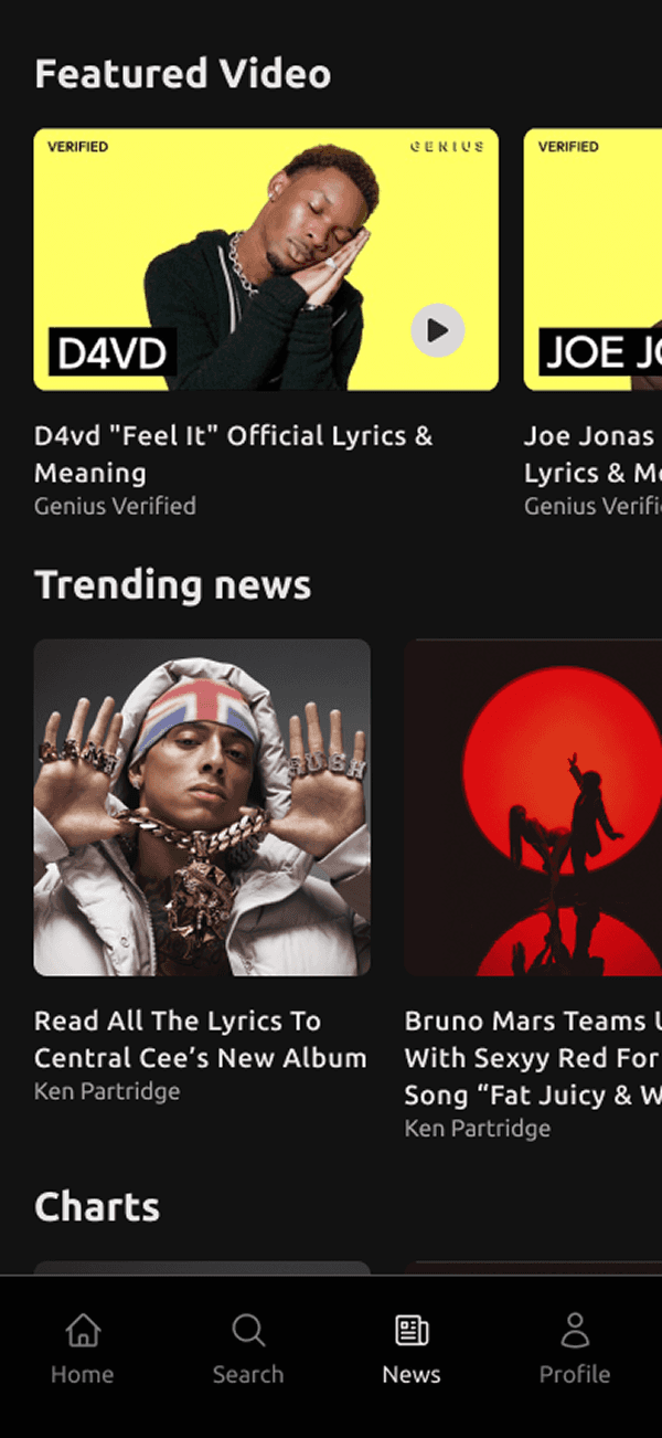
Home feed was reorganised into clear sections to show recently viewed and recommended content. News and videos were moved to a dedicated page.
Lyrics-only Toggle
Lyrics only mode provides clear visual separation between lyrics and annotation while allowing users to delve deep into annotation.

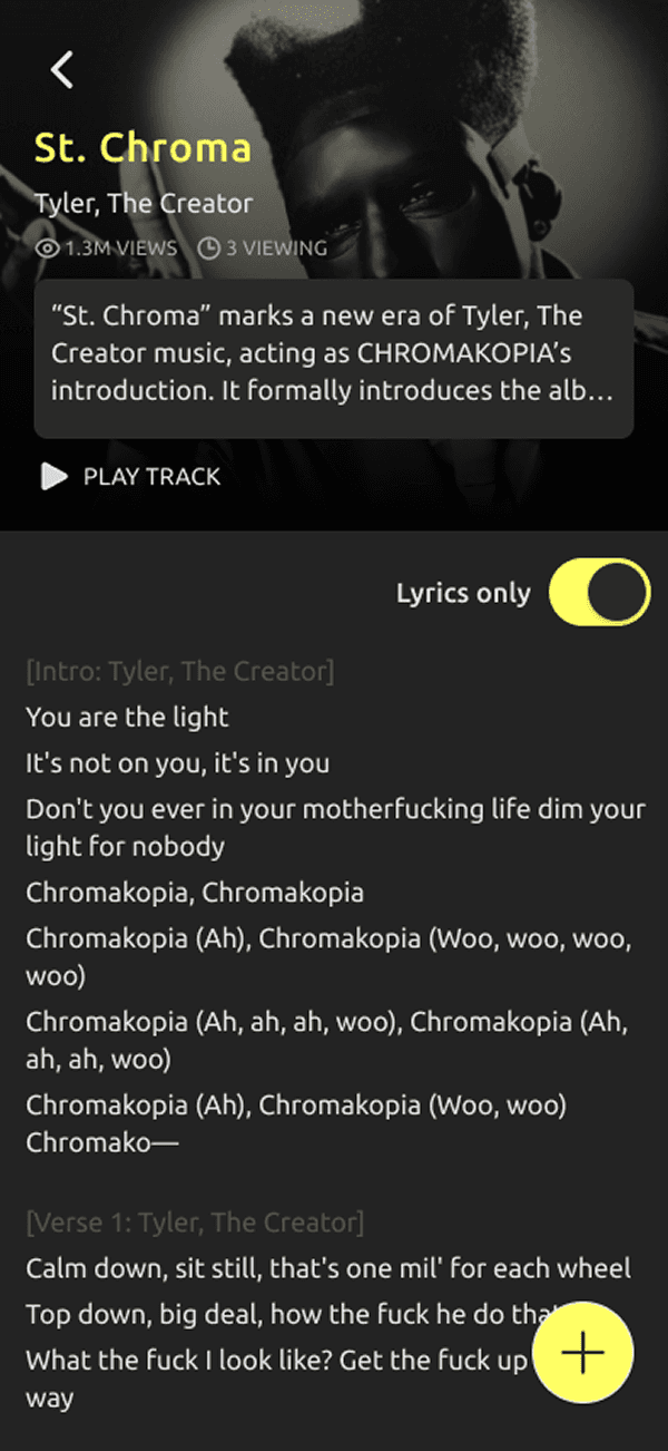
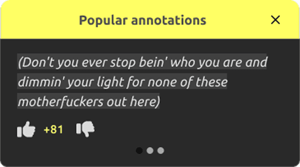
Popular Annotation
Snippets of popular annotations are introduced to the home and lyrics page to help users discover content.


Intuitive Annotation Flow
Annotation and lyrics edit were grouped under one visually distinct floating button at the bottom of the lyrics page. Formatting functions were represented as icons instead of text instructions. Help was placed more accessibly.


Learnings & reflections
Usability testing with existing users may not fully reveal usability issues as they already have a good understanding of the app from and have learned to circumvent any unintuitive interactions. In the next step, I would test the prototype with first-time users.
Additional user interviews about their goals and motivates may uncover more pain points that were not addressed in the usability testing. For example, the large amount of verified contributions can lower the overall quality of the Genius knowledge, making it less trustworthy for users. This would prompt me to look into additional feature requirements or even community guidance regarding knowledge contribution.